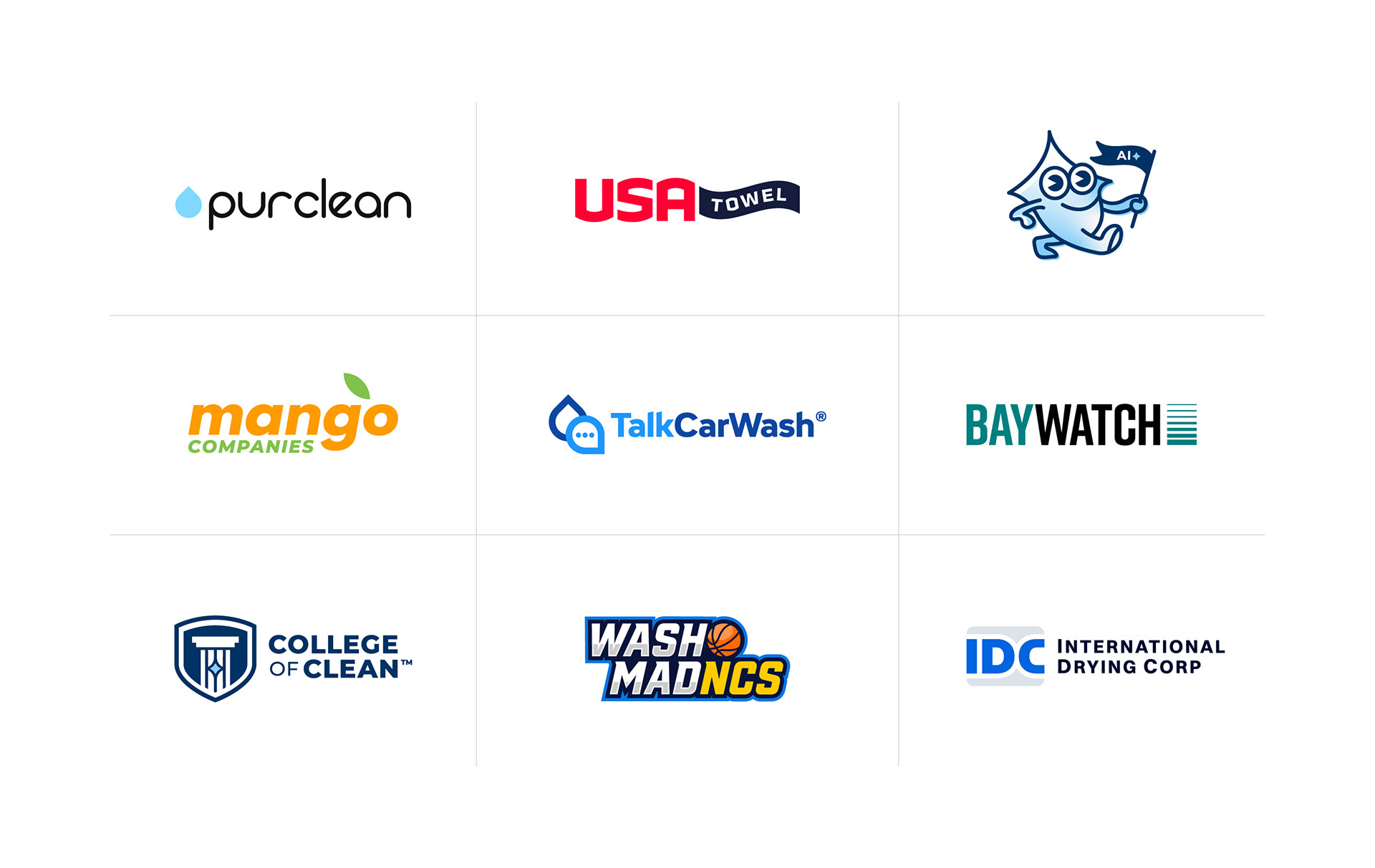
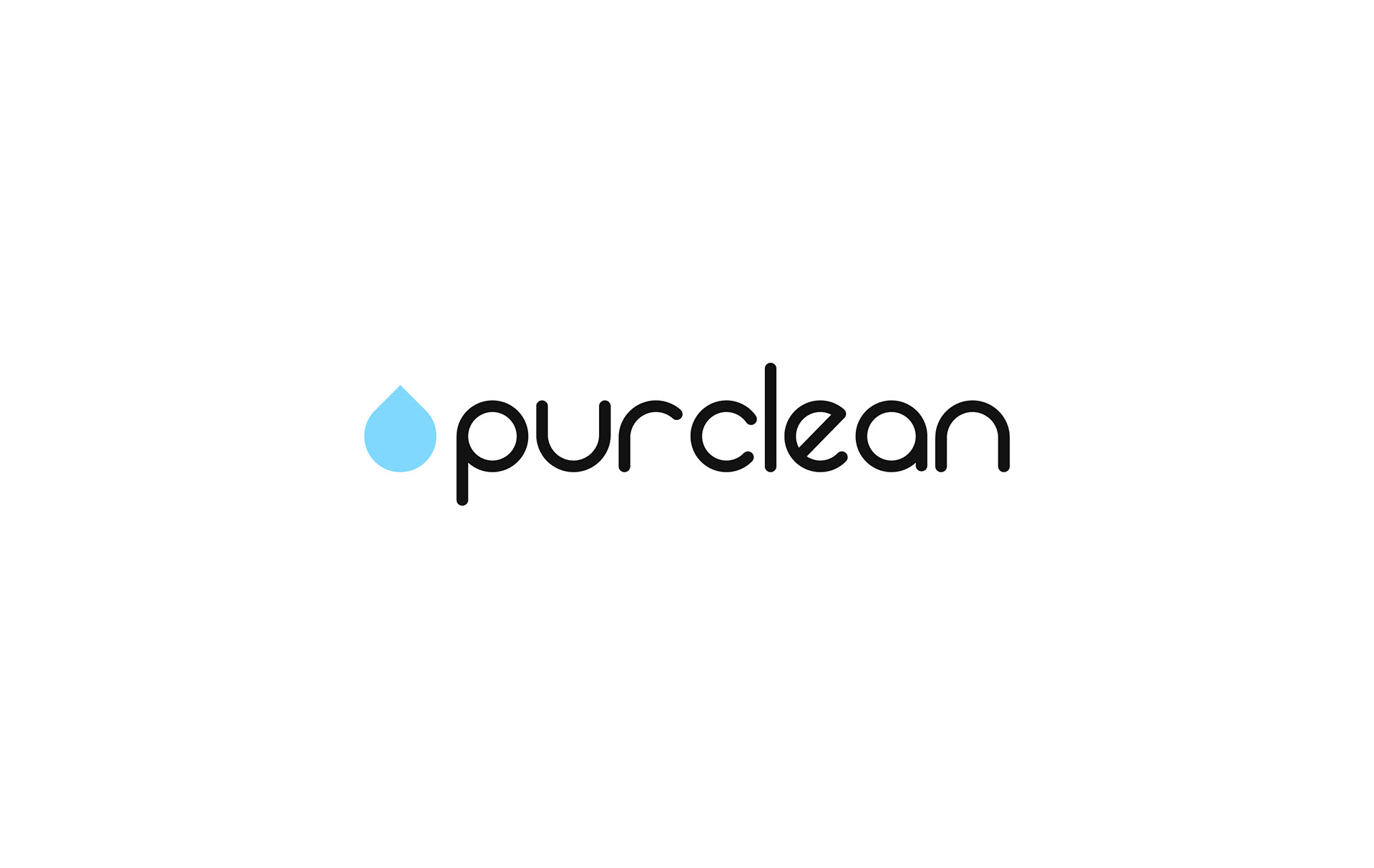
Logo Type: Rebrand | PurClean
Purpose of Logo: After joining the NCS portfolio in 2021, PurClean received a brand refresh to create stronger alignment with the family of brands and improve visibility within the marketplace.
Design Choices: The identity reflects PurClean's focus on water conservation and operational efficiency. A straightforward, approachable typeface was customized to create a distinctive mark, while a minimalist water droplet icon communicates the brand's purpose with clarity and simplicity.
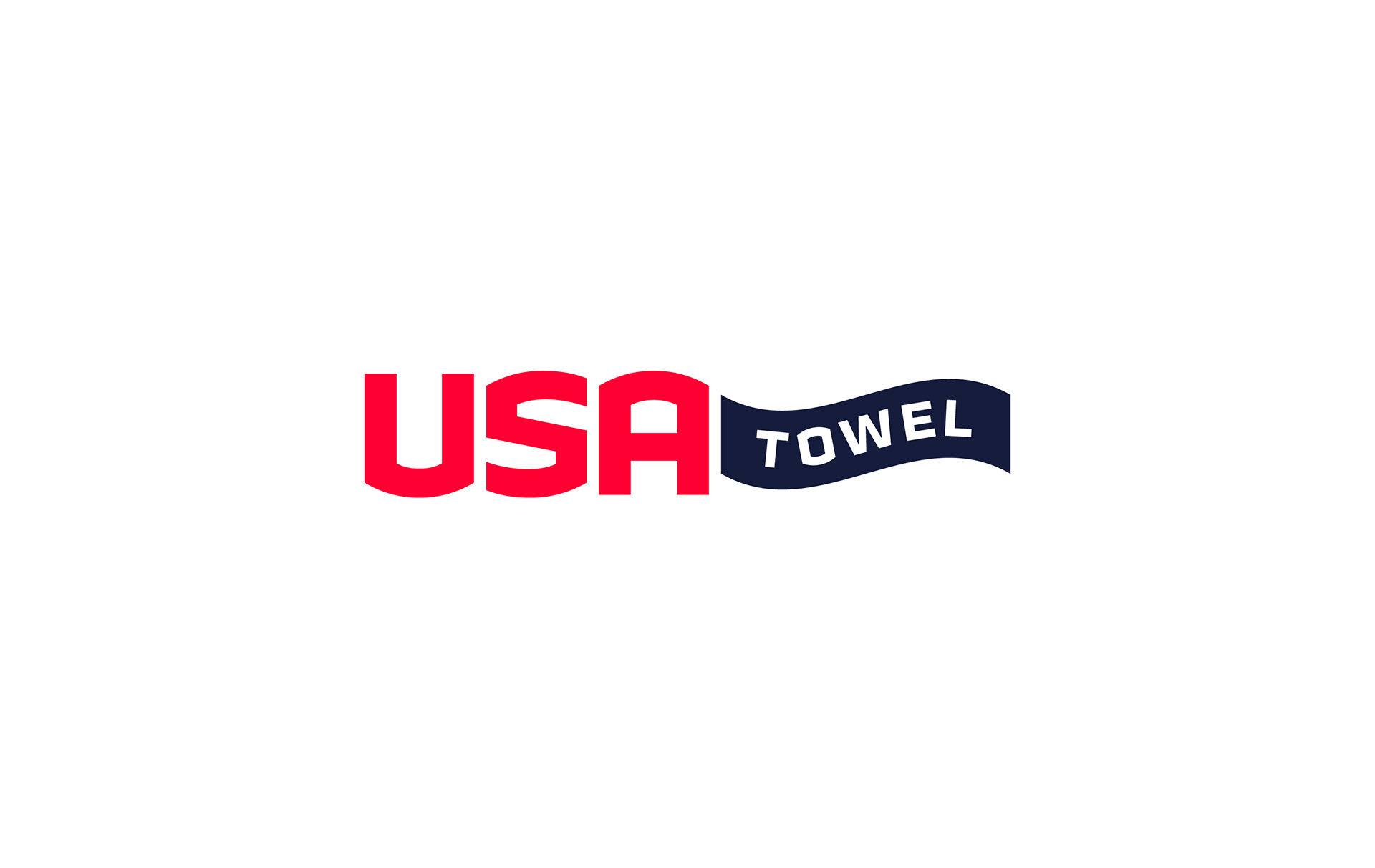
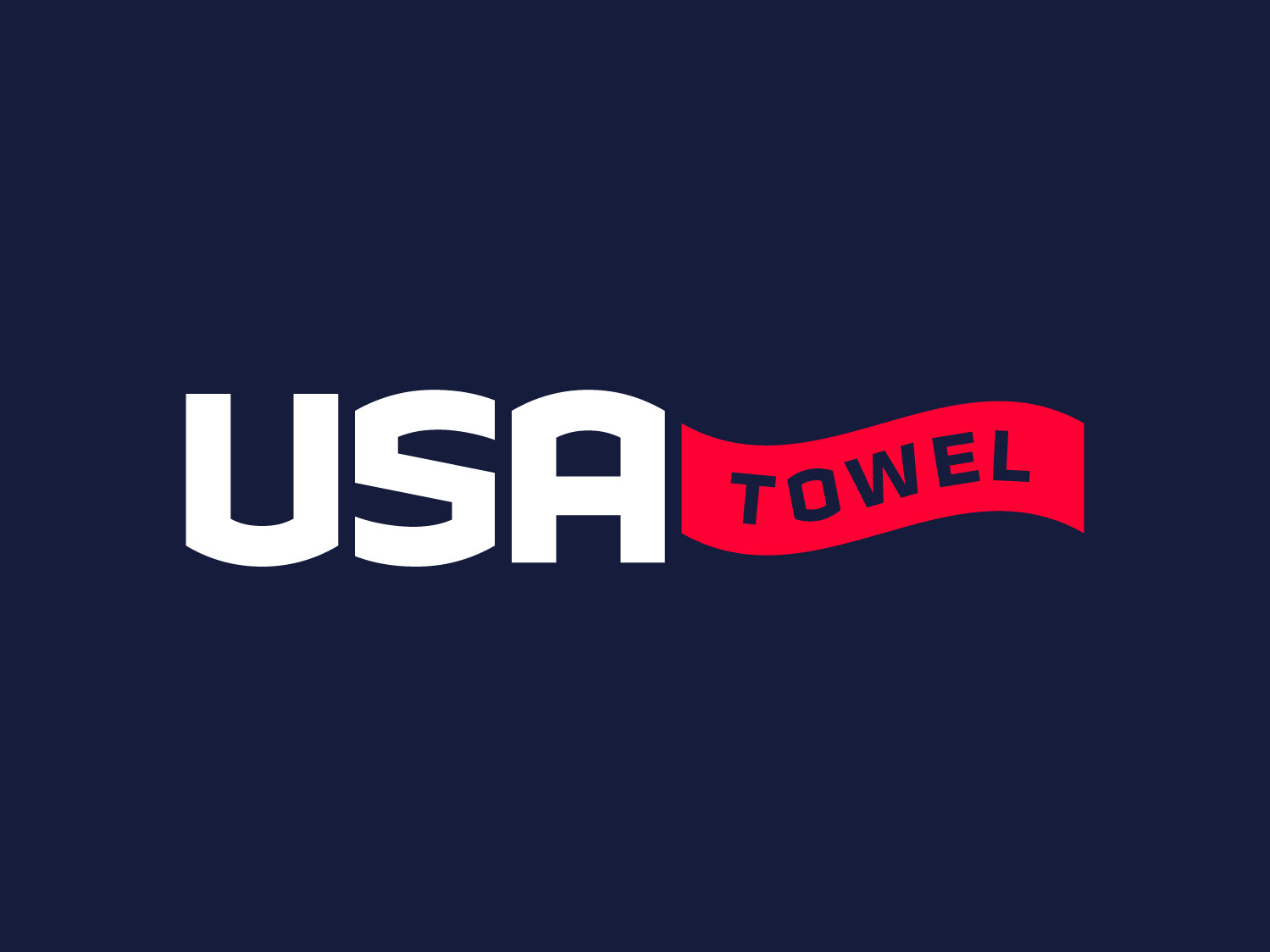
Logo Type: Rebrand | USA Towel
Purpose of Logo: Following the acquisition of USA Towel, the brand required a more versatile identity to support future growth and improve consistency across key touchpoints. The redesign addressed limitations of the previous mark while creating a stronger foundation for the future.
Design Choices: The icon reduces a towel to its most recognizable form, with subtle curves and motion that communicate flexibility, cleanliness, and ease of use. Supporting typography was carefully selected to complement the symbol, while custom refinements create a seamless transition between "USA" and "Towel," resulting in a cohesive and contemporary identity.
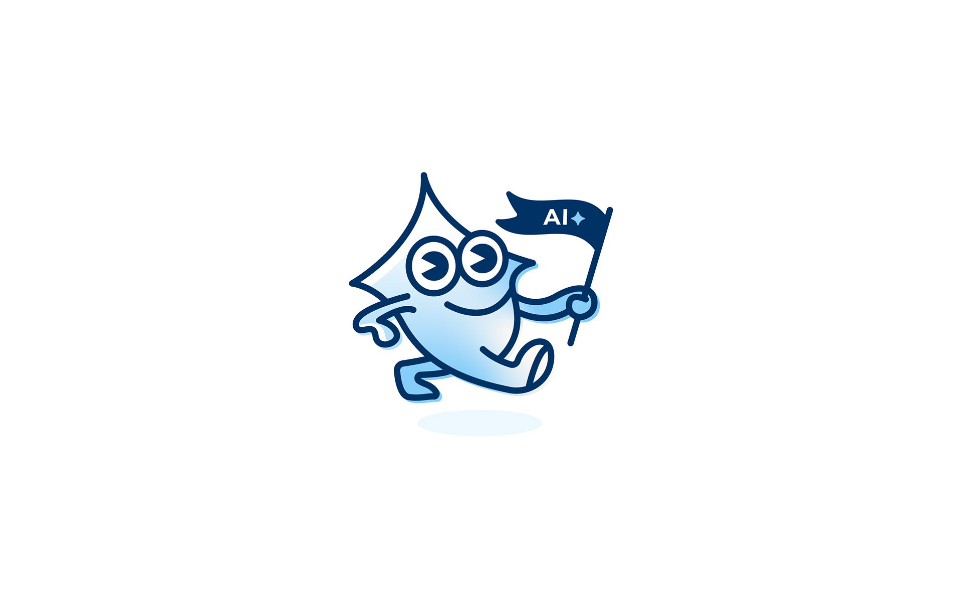
Logo Type: New | NCS AI Assist
Purpose of Logo: Created as an internal AI platform, the identity needed to be instantly recognizable, giving employees a clear association with company-wide AI tools, resources, and communication.
Design Choices: This project allowed for greater creative exploration, leading to the development of a mascot-driven identity that brought personality to the platform. The flag element was simplified into a compact icon that could function effectively within a navigation toolbar, providing a clear and recognizable access point throughout the user experience.
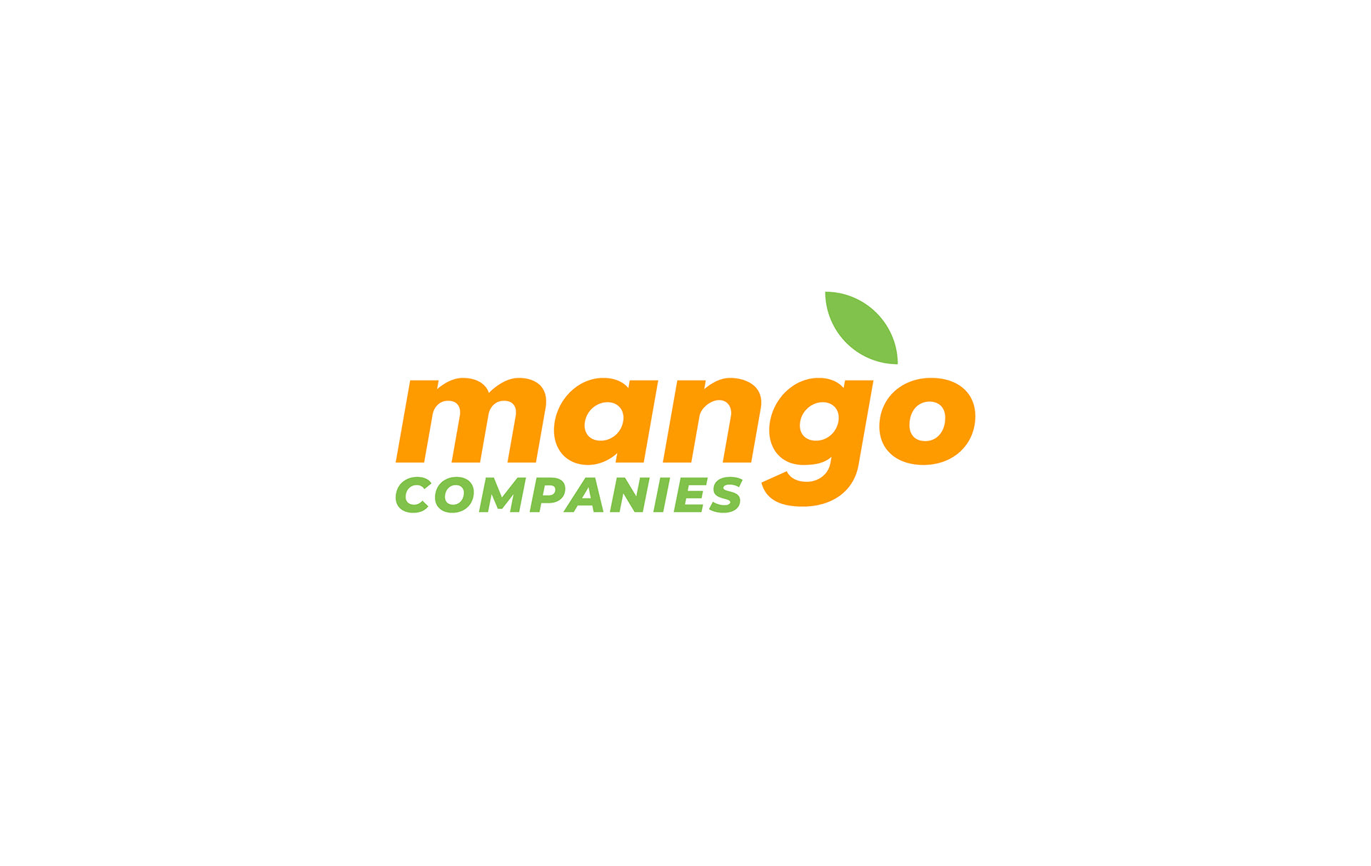
Logo Type: Corporate Identity | Mango Companies
Purpose of Logo: Launched in 2025, Mango Companies required a more corporate, versatile identity for internal use, as the primary logo was not well suited for applications beyond its mascot-driven design.
Design Choices: The existing logotype was retained to maintain brand recognition, while the mascot was removed to create a more streamlined corporate mark. A mango leaf was introduced to add subtle character and reinforce the brand’s visual language, supported by the established color palette. While Mango Express Wash continues to use its original branding for wash locations, the corporate identity adapts the logo by replacing “Express Wash” with “Companies” for internal and business-facing applications.
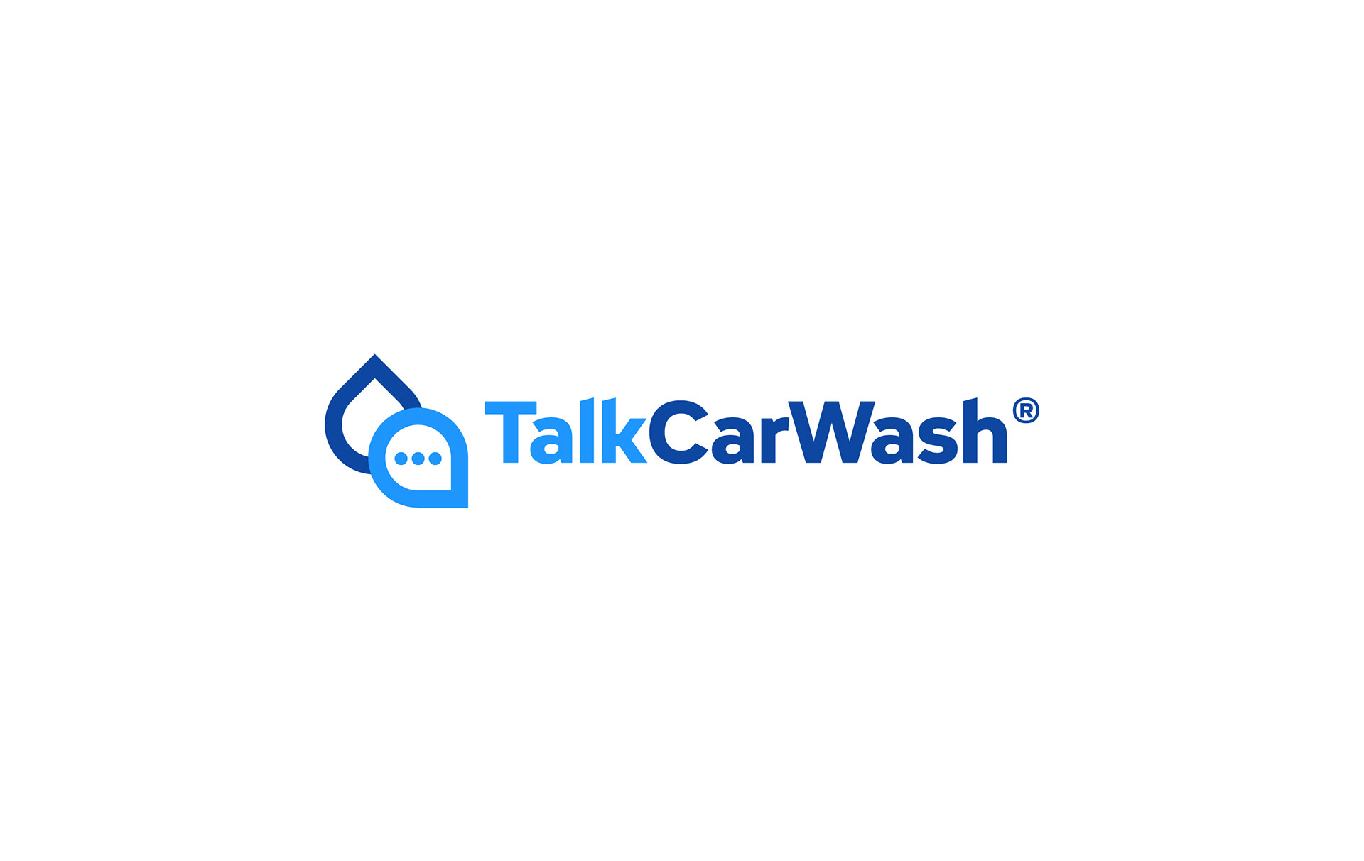
Logo Type: Rebrand | TalkCarWash®
Purpose of Logo: TalkCarWash® partnered with NCS to strengthen its brand and better support outreach for its global community focused on sharing expert advice and insights for car wash operators.
Design Choices: The identity combines a water droplet with a speech bubble to instantly communicate community and conversation within the car wash industry. Strategic use of color helps separate “Talk” and “CarWash,” improving clarity and legibility while reinforcing the brand’s dual focus on dialogue and industry expertise.
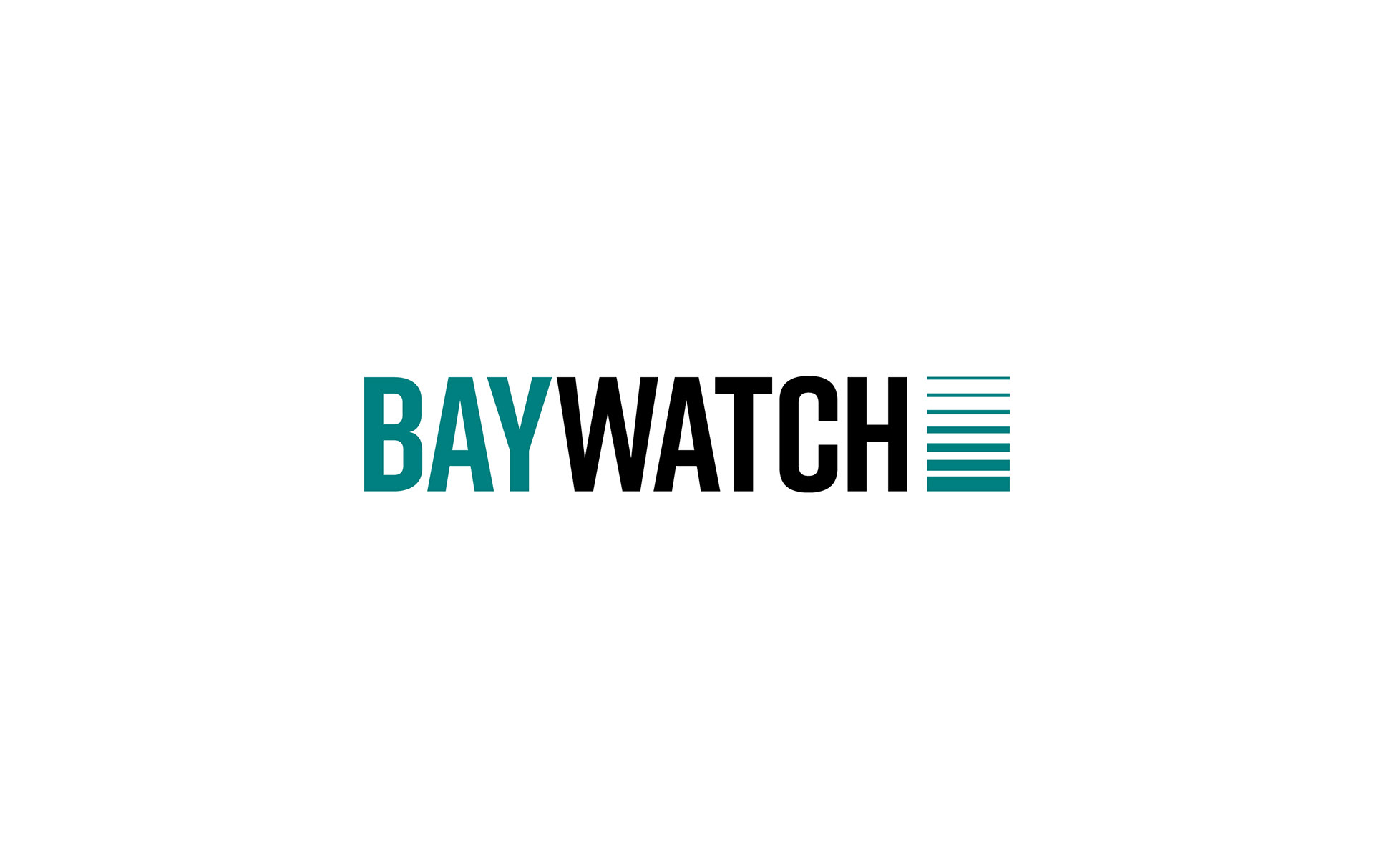
Logo Type: Rebrand | Baywatch
Purpose of Logo: The previous identity lacked clarity, relying on a generic water droplet and weak typography that did not communicate the scope of the business, which specializes in wash doors, heaters, and facility control technologies.
Design Choices: The concept centers on wash doors, using motion to suggest vertical movement as the system opens and closes. Tall, structured typography reinforces this idea, mirroring the form and scale of a wash door while creating a more intentional and industry-relevant visual identity.
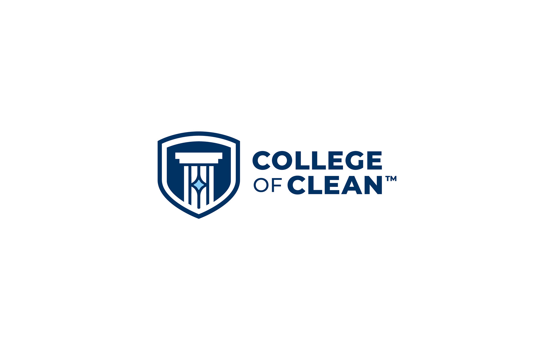
Logo Type: Rebrand | College of Clean™
Purpose of Logo: With NCS offering educational courses at their facilities, the brand required an elevated identity that clearly communicated learning and industry knowledge.
Design Choices: The design emphasizes education through a classical pillar symbol, creating an immediate association with learning and structure. The pillar lines intersect a central cleaning star, reinforcing the connection to the car wash industry. A shield enclosure adds a sense of credibility and preparedness, elevating the overall identity and signaling authority within the space.
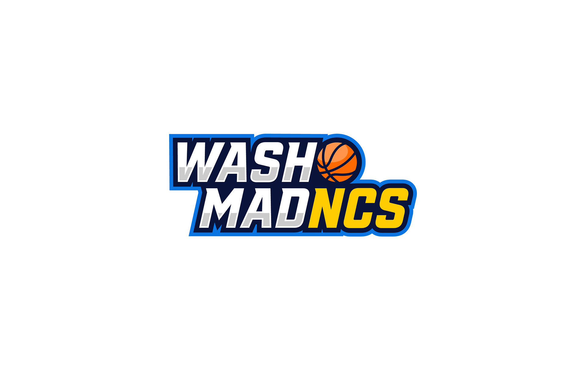
Logo Type: New | Wash MadNCS
Purpose of Logo: Created for a March Madness, the identity needed a distinct name and visual system that could be used across custom client packaging while navigating NCAA legal constraints around tournament branding.
Design Choices: The system draws from the familiar structure of March Madness typography while establishing its own identity through the integration of the NCS color palette and a basketball element. This combination creates immediate recognition and ties the concept back to the energy and culture of the tournament without directly replicating official branding.
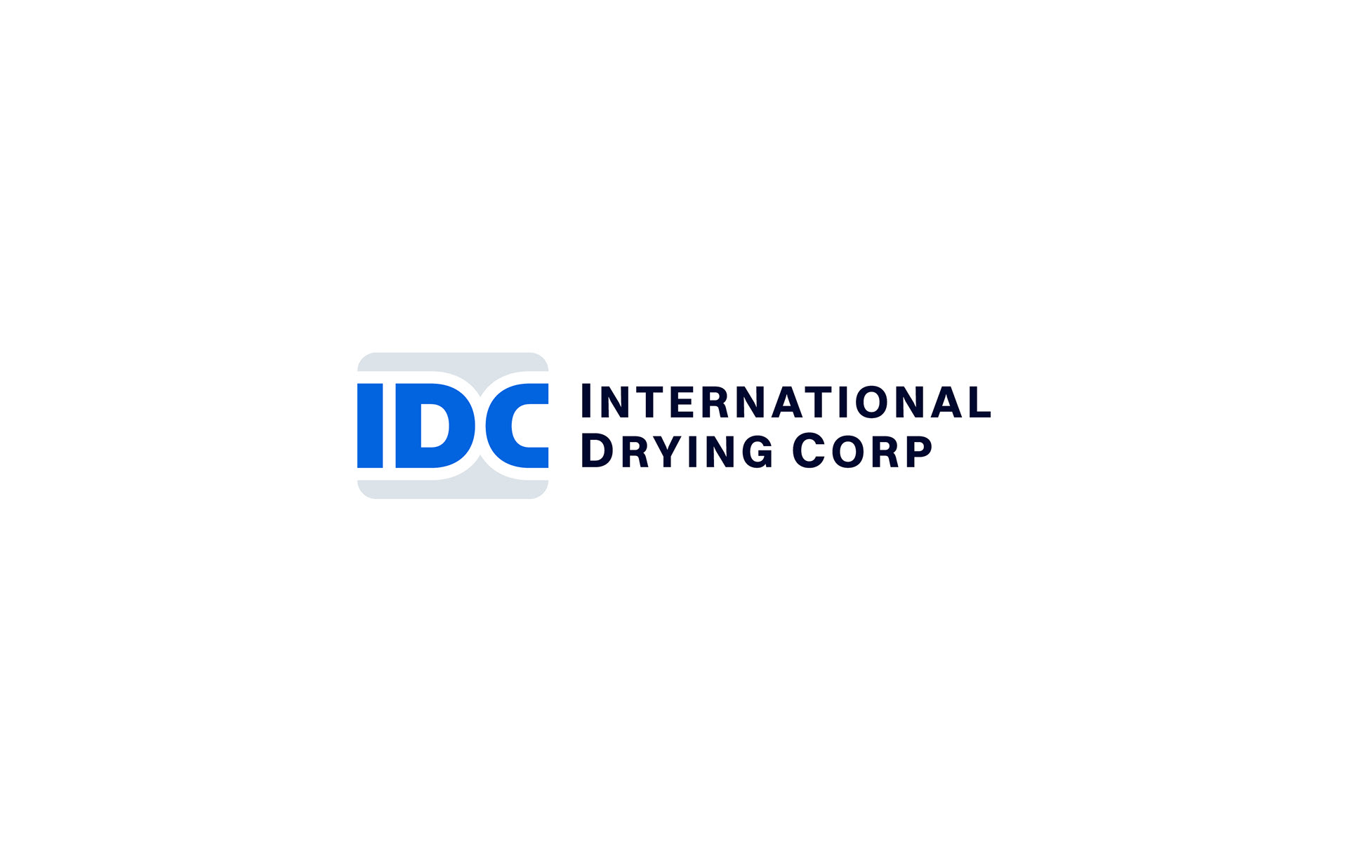
Logo Type: Rebrand | IDC
Purpose of Logo: After being acquired in 2023, the existing identity presented scalability challenges due to its horizontal structure, inconsistent typography, and unclear symbol system. A redesign was needed to better reflect the business and improve overall clarity and application.
Design Choices: The name was refined to International Drying Corp, with a focus on a timeless mark built around the acronym “IDC.” The system uses negative space to reference conveyor belts and drying processes, creating a more cohesive and recognizable visual identity.